
If you want to start learning web development, the first step is to create a website using HTML and CSS.
Many beginners think creating a website requires complex programming. The truth is, you can build your first working website in less than an hour using just two technologies:
HTML: It is used to create the structure of a website.
CSS: It is used to apply styles such as colors, fonts, and images. Using CSS, you can make your site responsive and more attractive.
If you want to create a website using HTML and CSS, this beginner guide will help you understand the complete process step by step.
We will build a simple 3-page websitestep-by-step. After completing this tutorial, you will understand:
- How websites are structured
- How to create multiple pages
- How navigation between pages works
- How to style your website using CSS
In this tutorial, we will guide you step-by-step on how to create a website using HTML and CSS, so even beginners can follow along and build a fully functional site.
Why Learn to Create a Website Using HTML and CSS?
Learning how to create a website using HTML and CSS is one of the first and most essential steps for anyone starting in web development. By understanding these technologies, you can build structured, styled, and responsive websites that work on both desktop and mobile devices. This knowledge not only helps you create your own projects but also lays the foundation for more advanced web development skills in the future.
Now let’s start from the very beginning.
By the end of this guide, you will confidently know how to create a website using HTML and CSS and make it look great on both desktop and mobile devices.
In this guide, we will walk you through how to create a website using HTML and CSS, step by step.
Prerequisites
Before starting a website creation, we need a few basic tools. Don’t worry — everything you need is free and easy to install.
Code Editor
A code editor is a tool used to write and manage your code.
The most popular editor is for beginners is Visual Studio Code.
Why many developers use it:
- Free and lightweight
- Supports many programming languages
- Great for web development
- Large library of helpful extensions
You can install it on Windows, macOS, or Linux.
Other editors you can use:
- Sublime Text
- Notepad++ – If you don’t have any code editor setup then you can use notepad++ or notepad also for writing code.
However, for beginners, Visual Studio Code is the best choice.
Web Browser
We need a web browser to view and test our website. A browser allows us to see how our website looks and works.
Popular Web Browsers:
- Google Chrome
- Mozilla Firefox
- Microsoft Edge
Most people prefer Google Chrome because it has powerful developer tools.
What is HTML?
HyperText Markup Language (HTML) is the standard language used to structure and organize content on web pages.
It defines elements such as:
- Headings – It is used to create titles and subtitles on a webpage.
- Paragraphs – It is used to add text content to a webpage.
- Images – It is used to display images on a website.
- Links – It is used to connect one page to another page or website.
- Navigation menus – They help users navigate between different sections of a website.
- Sections – It is used to divide a webpage into different parts for better organization.
HTML is the skeleton of a website.
Example:
<h1>Welcome to My Website</h1>
<p>This is my first webpage.</p>What is CSS?
CSS (Cascading Style Sheets) is used to style and design the structure created with HTML.
It allows developers to control the colors, fonts, spacing, and layout of web pages to make them visually appealing.
CSS controls given things like:
- colors
- layout
- fonts
- spacing
- responsiveness
Example:
h1{
color: blue;
}CSS makes the website look good.
Step-by-Step Guide to Create a Website Using HTML and CSS
In this guide, we will learn how to create a website using HTML and CSS by building a simple multi-page website project.
Step 1: Create Your Website Project Folder
Before writing code, we need a folder to store our website files.
On Windows
Let’s create a folder for your website on the Desktop (or any directory you prefer).
- Go to your Desktop or Documents
- Right-click → New → Folder
- Name the folder:
my-websitemy-website folder will contain all your website files.
You can name the folder anything you like. Here, we’ll name it “my-website” for simplicity.
Step 2: Open the Folder in Visual Studio Code
Now open the folder using Visual Studio Code. Follow the given steps to open my-website folder in Visual Studio Code.
- Open Visual Studio Code
- Click File → Open Folder
- Select my-website
- Click “Select Folder”.
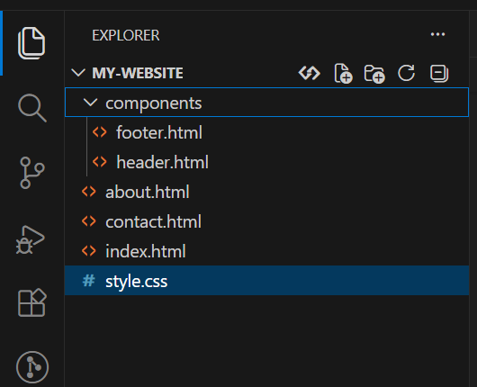
Now you can see our folder opened folder in Explorer panel.
Step 3: Create Website Files & Folder Structure
Inside the my-website folder,
You will see the New File icon. Click on it and create the following files:
- index.html
- about.html
- contact.html
- style.css
Also create a folder named “components” inside the my-website folder.
Create the following two files inside the components folder.
- header.html
- footer.html
Type each file name and press Enter to create the file before creating the next one.
Now your project structure should look like this:
Now we will create website.
Step 4: Add Reusable Header (components/header.html)
This header will be shared on all pages. It includes the site title, navigation links, and the hamburger menu for mobile.
<header>
  <h1>My Website</h1>

  <!-- Hamburger Button for Mobile -->
  <button id="menu-toggle">☰</button>

  <nav id="nav-links">
    <a href="index.html">Home</a>
    <a href="about.html">About</a>
    <a href="contact.html">Contact</a>
  </nav>
</header>Step 5: Add Reusable Footer (components/footer.html)
The footer is simple and also shared by all pages.
<footer>
  <p>© 2026 My Website</p>
</footer>Step 6: Add Your CSS Styling (style.css)
Now it’s time to style your pages. Using CSS, we enhance your HTML and CSS website to make it visually appealing and responsive. This stylesheet will handle:
- Colors, fonts, and layout
- Mobile responsiveness
- The hamburger menu toggle
/* Reset default margins and paddings */
* {
  margin: 0;
  padding: 0;
  box-sizing: border-box;
}

/* Make sure html and body fill viewport */
html, body {
  height: 100%;
}

/* General Styles */
body {
  font-family: Arial, sans-serif;
  margin: 0;
  min-height: 100vh;       /* Full viewport height */
  display: flex;
  flex-direction: column;  /* Stack children vertically */
}

/* Header, main content, and footer structure */
header {
  background: #333;
  color: white;
  text-align: center;
  padding: 20px;
  flex-shrink: 0; /* Prevent shrinking */
}

nav {
  background: #555;
  text-align: center;
  padding: 10px;
}

nav a {
  color: white;
  margin: 10px;
  text-decoration: none;
  font-weight: bold;
}

nav a:hover {
  color: yellow;
}

/* The main section grows to fill available space */
section {
  padding: 40px;
  flex-grow: 1;  /* Push footer down */
}

footer {
  background: #333;
  color: white;
  text-align: center;
  padding: 15px;
  flex-shrink: 0; /* Prevent shrinking */
  margin-top: auto; /* Push footer to bottom */
}

/* Mobile Responsive Styles */
@media (max-width: 768px) {
  nav a {
    display: block;
    margin: 10px 0;
  }

  section {
    padding: 20px;
  }

  header, footer {
    text-align: center;
    padding: 15px;
  }
}

/* Smaller devices */
@media (max-width: 480px) {
  h1 { font-size: 24px; }
  h2 { font-size: 20px; }
  p { font-size: 16px; }
}

img {
  max-width: 100%;
  height: auto;
}

/* Hamburger Button */
#menu-toggle {
  display: none; /* Hidden on desktop */
  background: #555;
  color: white;
  border: none;
  font-size: 24px;
  padding: 10px;
  cursor: pointer;
}

/* Mobile Navigation */
@media (max-width: 768px) {
  #menu-toggle { display: block; }
  #nav-links { display: none; text-align: center; background: #555; }
  #nav-links.show { display: block; }
  #nav-links a { display: block; margin: 10px 0; }
}

#menu-toggle:hover {
  background: #333;
  color: yellow;
}Step 7: Create the Home Page (index.html)
This page loads the header and footer components dynamically, and enables the mobile menu toggle.
<!DOCTYPE html>
<html>
<head>
  <meta charset="UTF-8">
  <meta name="viewport" content="width=device-width, initial-scale=1.0">
  <title>My Website - Home</title>
  <link rel="stylesheet" href="style.css">
</head>
<body>

<!-- Header -->
<div id="header"></div>

<!-- Main Content -->
<section>
  <h2>Welcome</h2>
  <p>This is the home page of my website built using HTML and CSS.</p>
</section>

<!-- Footer -->
<div id="footer"></div>

<!-- JS: Load header/footer and toggle mobile menu -->
<script>
function loadHTML(id, url, callback){
  fetch(url)
    .then(response => response.text())
    .then(data => {
      document.getElementById(id).innerHTML = data;
      if(callback) callback();
    });
}

// Load header with mobile menu
loadHTML('header', 'components/header.html', () => {
  const menuButton = document.getElementById('menu-toggle');
  const navLinks = document.getElementById('nav-links');
  if(menuButton && navLinks){
    menuButton.addEventListener('click', () => {
      navLinks.classList.toggle('show');
    });
  }
});

// Load footer
loadHTML('footer', 'components/footer.html');
</script>

</body>
</html>Step 8: Create the About Page (about.html)
Similar to the home page but with different content.
<!DOCTYPE html>
<html>
<head>
  <meta charset="UTF-8">
  <meta name="viewport" content="width=device-width, initial-scale=1.0">
  <title>My Website - About</title>
  <link rel="stylesheet" href="style.css">
</head>
<body>

<div id="header"></div>

<section>
  <h2>About This Website</h2>
  <p>This website is a beginner project created using HTML and CSS.</p>
  <p>It demonstrates how multiple pages can share the same header and footer.</p>
</section>

<div id="footer"></div>

<script>
function loadHTML(id, url, callback){
  fetch(url)
    .then(response => response.text())
    .then(data => {
      document.getElementById(id).innerHTML = data;
      if(callback) callback();
    });
}

loadHTML('header', 'components/header.html', () => {
  const menuButton = document.getElementById('menu-toggle');
  const navLinks = document.getElementById('nav-links');
  if(menuButton && navLinks){
    menuButton.addEventListener('click', () => {
      navLinks.classList.toggle('show');
    });
  }
});

loadHTML('footer', 'components/footer.html');
</script>

</body>
</html>Step 9: Create the Contact Page (contact.html)
Here, you will add your contact information so visitors can reach you.
<!DOCTYPE html>
<html>
<head>
  <meta charset="UTF-8">
  <meta name="viewport" content="width=device-width, initial-scale=1.0">
  <title>My Website - Contact</title>
  <link rel="stylesheet" href="style.css">
</head>
<body>

<div id="header"></div>

<section>
  <h2>Contact Information</h2>
  <p>Email: example@email.com</p>
  <p>Phone: +91 9876543210</p>
</section>

<div id="footer"></div>

<script>
function loadHTML(id, url, callback){
  fetch(url)
    .then(response => response.text())
    .then(data => {
      document.getElementById(id).innerHTML = data;
      if(callback) callback();
    });
}

loadHTML('header', 'components/header.html', () => {
  const menuButton = document.getElementById('menu-toggle');
  const navLinks = document.getElementById('nav-links');
  if(menuButton && navLinks){
    menuButton.addEventListener('click', () => {
      navLinks.classList.toggle('show');
    });
  }
});

loadHTML('footer', 'components/footer.html');
</script>

</body>
</html>Step 10: Run Website
To view your website:
- Open the index.html file
- Right click on it you can see open with live server click on it
- It will open in your browser
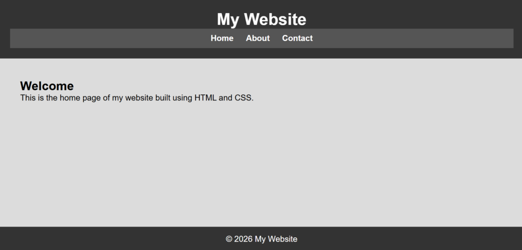
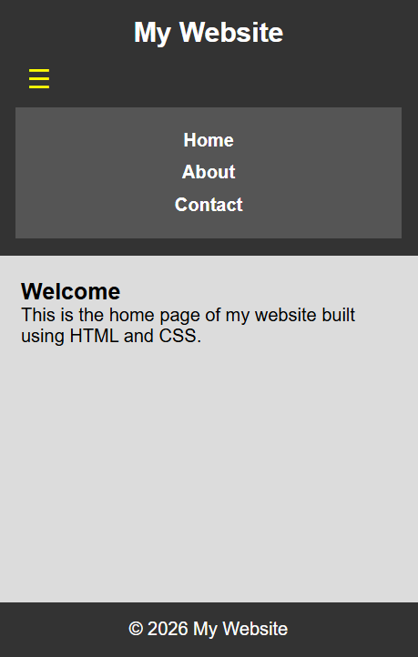
After following all the steps in this tutorial, you should now be able to create a website using HTML and CSS and see the final output on both desktop and mobile devices.
1. Desktop View:
Desktop View of the Website
2. Mobile View
Mobile Responsive View with Hamburger Menu
As you can see, it is easy to create a website using HTML and CSS that works on both desktop and mobile devices.
Tip: Use Live Server Extension
If you are using Visual Studio Code, install the Live Server extension.
Benefits:
- Automatically refreshes the browser
- Faster development
- Easier testing
Many web developers use this extension during development.
Common Mistakes Beginners Make
When creating their first website, beginners often make these mistakes:
1. Incorrect file names
Example:
Index.html
index.HTMLUse consistent naming like:
index.htmlAlways use lowercase letters for file names.
2. Forgetting to link CSS
Always connect your CSS file:
<link rel="stylesheet" href="style.css">3. Broken navigation links
Make sure file names match exactly.
Conclusion
Congratulations! You’ve successfully learned how to create a website using HTML and CSS. By following this step-by-step guide, you now understand how to structure web pages, create multiple pages, add reusable headers and footers, and style your website for both desktop and mobile views.
Learning to create a website using HTML and CSS gives you the foundation to explore more advanced web development topics, like JavaScript interactivity or responsive design frameworks.
Remember to test your website on different devices, apply CSS styling carefully, and reuse components efficiently. With these skills, you can confidently build functional and visually appealing websites from scratch.